Minimalist Design Tips for a Modern Look
21 October 2026
Minimalism has a reputation problem. Say the word in a room full of homeowners and half of them picture a white box with a single chair, a cactus, and a vague sense of loneliness. The other half picture a storage unit they are paying too much for. Both groups are wrong, but you can see how they got there. Somewhere along the line, minimalist design got confused with deprivation. It is not. Done well, minimalism is not about having less. It is about making what you have count.
I have walked through hundreds of properties over the years, from cramped studios to sprawling suburban builds, and the most memorable ones share a trait that has nothing to do with budget. They feel calm. They feel intentional. You notice the light before you notice the furniture. That is minimalism working the way it should, and it is far more achievable than most people think. It also goes wrong in predictable ways, which means the mistakes are avoidable once you know what to look for.
This guide is not a list of things to throw away. It is a working manual for designing a modern, minimalist home that still feels like a home. We will cover the principles, the practical moves, the trade-offs, and the traps. Grab a tape measure. You will want one.
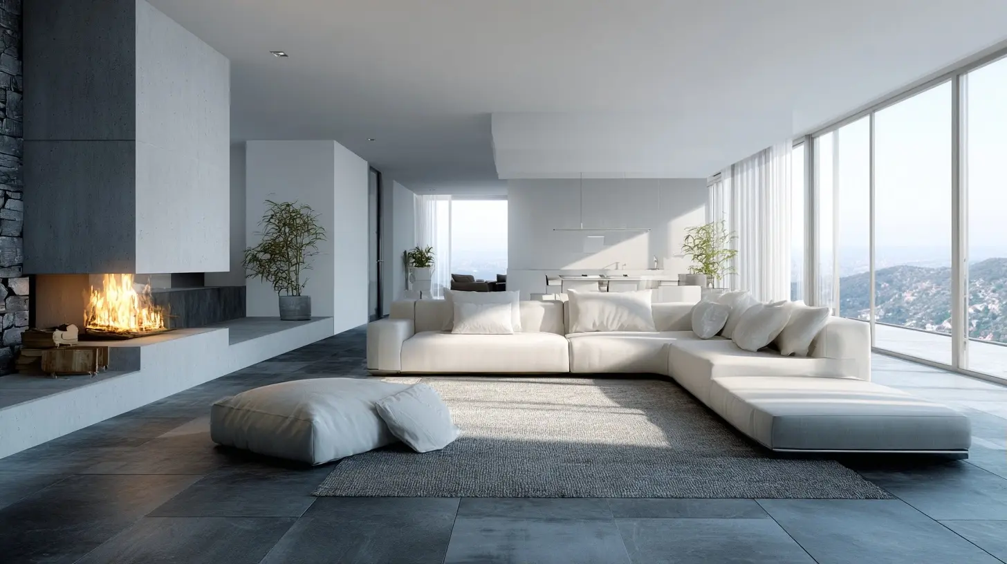
What Minimalism Actually Means in a Home
Minimalist design is a set of decisions about what deserves your attention. Every object in a room competes for visual weight, and minimalism is the practice of managing that competition so the important things win. A well-designed minimalist room might contain fifty objects. A cluttered room might contain fifty objects too. The difference is that in the first room, each object earns its place.This matters because minimalism is often sold as an aesthetic when it is really a process. You can buy all the pale wood and matte black hardware you want, but if you never make decisions about what stays and what goes, you will end up with a very tasteful pile of stuff. The aesthetic follows the decisions, not the other way around.
It also helps to separate minimalism from two things it gets confused with. The first is modernism, which is a historical design movement with its own rules about form and material. You can have a minimalist room full of traditional furniture, and you can have a maximalist room full of modern pieces. The second is frugality. Minimalism is not about spending less. It frequently costs more, because you are buying fewer things at higher quality. A single well-made oak dining table will outlast four cheap ones and look better doing it, but the upfront check is real.
The working definition I use with clients is simple: minimalism is the removal of anything that does not contribute to how the room functions or how it feels. Note the word "or." Function alone gives you a dentist's waiting room. Feeling alone gives you a showroom nobody can live in. You need both.
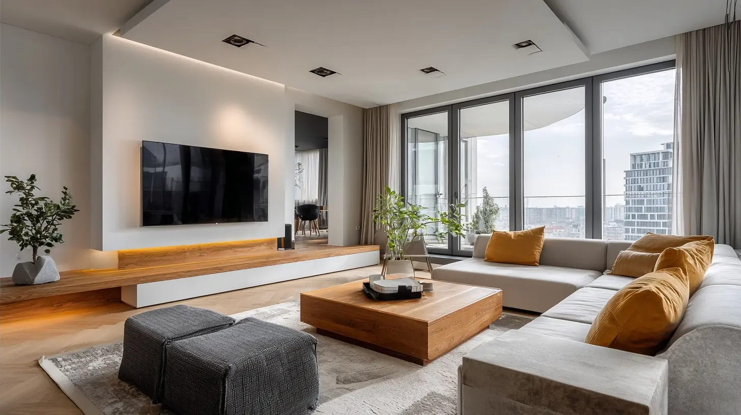
The Principles That Do the Heavy Lifting
Before we get to paint colors and sofa legs, there are four principles that govern every good minimalist decision. Understanding them will save you from copying a Pinterest board that does not fit your life.Visual Weight and Negative Space
Every object has visual weight, which is a combination of size, color contrast, texture, and detail. A dark, intricately patterned rug carries more weight than a pale, flat one of the same dimensions. Minimalism works by keeping total visual weight low and letting negative space, meaning the empty areas, do the compositional work. Empty space is not wasted space. It is the breathing room that makes the occupied space legible.Here is the practical test. Stand in the doorway of a room and squint until the details blur. What you see is the visual weight distribution. If the room looks heavy on one side, you have a balance problem, and no amount of decluttering will fix it. You need to move something, remove something, or add something lighter on the opposite side.
Intentional Contrast
A common misconception is that minimalist rooms should be uniformly soft and low contrast. In practice, flat, low-contrast rooms read as foggy and forgettable. The best minimalist interiors use a small number of strong contrasts: a dark frame against a pale wall, a rough linen against smooth plaster, a warm wood against cool stone. Contrast is what gives a restrained room its energy. Without it, minimalism becomes beige soup.Repetition and Rhythm
Repetition is the quiet workhorse of minimalism. Repeating a material, a color, or a shape creates coherence without adding visual noise. Three identical pendant lights over an island. The same wood tone on the floor, the shelving, and the door frames. The same matte black on every piece of hardware in the house. Rhythm is what makes a sparse room feel composed rather than accidental.The trade-off is that repetition magnifies mistakes. If you repeat a material you do not love, you will see it everywhere. Choose your repeated elements carefully, because you are marrying them.
Function First, Form Follows
In a minimalist home, every piece should justify its existence. That does not mean every piece must be strictly utilitarian. A sculpture can justify itself by making you happy every morning. But it does mean you should be able to articulate why each item is there. If the answer is "it was on sale" or "we have always had it," that is a candidate for removal.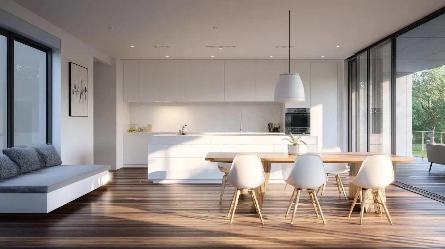
Start With the Bones, Not the Furniture
Most people decorate a minimalist home backwards. They buy furniture, then realize the room feels cramped, then buy storage, then buy more storage for the storage. The order should be reversed: architecture first, then lighting, then storage, then furniture, then objects. Each layer constrains the next, and getting the early layers right makes the later ones almost automatic.Decluttering as a Design Step
Decluttering is not a moral exercise. It is a spatial one. Before you change a single finish, empty the room as much as you reasonably can and live with it for a week. You will learn things you cannot learn from a floor plan. You will notice the afternoon light hits the wall at four o'clock and that the room feels bigger with the bookshelf gone. You will also notice which items you genuinely miss, which is a far better signal than which items you feel guilty about.A useful rule for the sorting phase: if you cannot remember the last time you used it and you would not buy it again at full price, it does not get to occupy prime real estate. Store the maybes in a box for a month. Most of them will stay in the box, and you will have your answer.
Rethinking Storage Before You Buy More
Here is a hard truth about minimalism: visible storage is a design decision, and hidden storage is a design decision. Both are valid, and they produce very different rooms. Open shelving makes a room feel airy but demands that everything on it be beautiful and sparse. Closed cabinetry keeps the room calm but can feel heavy if it runs floor to ceiling in a dark color.The mistake is treating storage as an afterthought. If your home has no place to put things, minimalism will fail no matter how committed you are. Build the storage first, ideally into the architecture, and make it generous. A wall of built-in cabinets painted the same color as the wall reads as almost nothing, which is exactly what you want. A freestanding shelving unit full of bins reads as clutter, which is exactly what you do not want.
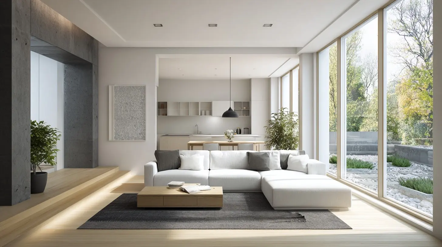
Color and Material Strategies That Actually Work
Minimalist palettes are often described as "neutral," which is unhelpfully vague. Let us get specific.The Case for a Restricted Palette
A restricted palette, typically two to four colors used consistently across a home, is the single most reliable way to make a space feel modern and calm. The reason is simple: fewer colors mean fewer visual decisions for your brain to process. This is why galleries paint their walls white and why luxury hotels use the same taupe everywhere.The trade-off is that a restricted palette can read as cold if you do not build in warmth. The fix is texture, not color. A room in cream, pale oak, and charcoal can feel like a spa or a morgue depending on whether the fabrics are nubby linen or slick polyester. When in doubt, add texture before you add color.
Warm Neutrals vs. Cool Neutrals
Warm neutrals, meaning creams, oatmeals, warm grays, and taupes, are forgiving and flattering. They make small rooms feel larger and photographs look good. Cool neutrals, meaning true grays, blue-grays, and stark whites, feel sharper and more architectural, but they can turn gloomy in low light and can make skin tones look washed out in photographs.My rule of thumb: warm neutrals for rooms you live in daily, cool neutrals for rooms you pass through or want to feel crisp. And always test paint on the actual wall. A color chip looks different on every wall in your house because light direction, floor color, and surrounding finishes all shift it. Paint a large sample board, move it around the room over a few days, and look at it in the morning and at night. This sounds fussy. It is not. It is the difference between a room you love and a room you repaint in eighteen months.
The Role of Natural Materials
Natural materials, meaning wood, stone, wool, linen, cotton, leather, and clay, are the secret ingredient in minimalist rooms that feel warm. They carry subtle variation that manufactured surfaces lack, and that variation gives the eye something to rest on without adding visual noise. A white wall next to an oak floor next to a linen sofa is technically a three-color room, but it reads as rich because each material has depth.The trade-off is maintenance and cost. Real stone stains. Real wood dents. Linen wrinkles, which is either the point or a dealbreaker depending on your tolerance. If that sounds like too much, choose materials that age gracefully rather than materials that pretend to be something they are not. A distressed engineered floor will look worse every year. A solid oak floor will look better.
Furniture: Fewer Pieces, Better Pieces
Minimalist furniture selection is where most budgets go to die or to thrive, and the difference is almost always planning.Scale and Proportion
The most common furniture mistake in minimalist homes is buying pieces that are too small. People assume fewer pieces means smaller pieces, and they end up with a sofa that floats in the middle of the room like a life raft. Actually, the opposite is usually true. Fewer, larger pieces create a calmer composition than many small ones, because the eye registers fewer objects.Before you shop, tape the footprint of each piece on the floor with painter's tape. Walk around it for a day. You will discover things no showroom can tell you, like whether the sofa blocks the path to the kitchen or whether the coffee table leaves enough legroom. This five-dollar exercise has saved clients thousands.
Legs, Lines, and Visual Air
Furniture with visible legs and open space underneath reads as lighter than furniture that sits flush on the floor. This is why mid-century pieces remain popular in minimalist interiors: the tapered legs lift the mass off the ground and let the floor plane continue underneath. A heavy upholstered sofa on a solid plinth can work beautifully, but it will always feel grounded and substantial. Neither is wrong. Just know which effect you are choosing.Built-Ins and Multifunctional Pieces
In smaller homes, built-ins are minimalism's best friend. A window seat with storage underneath, a desk that folds into a wall, a bed with drawers built into the frame. The logic is that built-ins use space that freestanding furniture cannot, and they disappear into the architecture. The trade-off is permanence. You cannot move a built-in to your next house, and you cannot easily change your mind. If you rent, this option is mostly off the table, which is why renters should lean harder on vertical storage and furniture that does double duty.
Lighting: The Most Underrated Layer
Ask a hundred people what makes a room feel modern and maybe three will say lighting. Those three are right.Layered Lighting Beats a Single Source
A single overhead fixture flattens a room and casts unflattering shadows. Minimalist lighting works in layers: ambient light for general illumination, task light for specific activities, and accent light for depth and drama. In a living room, that might mean recessed ceiling lights on a dimmer, a floor lamp beside the reading chair, and a small lamp on a console that washes the wall. The room does not look busy. It looks alive.Fixtures as Sculpture
Because minimalist rooms have few objects, the objects that remain get more attention. A pendant light over a dining table becomes a focal point by default. This is an opportunity. Choose fixtures with a clear silhouette, and resist the urge to hang three different styles in one sightline. One strong fixture reads as a decision. Three competing fixtures read as a shopping spree.The Dimmer Rule
If I could mandate one upgrade in every home, it would be dimmers on every switch. Light level is the cheapest way to change a room's mood, and a room that can go from bright task lighting to a low evening glow feels far more designed than one stuck at a single brightness. This is not a minimalist-specific tip, but minimalism exposes bad lighting more than any other style, because there is no clutter to hide behind.Common Mistakes and How to Avoid Them
Mistake One: Confusing Minimalism With Emptiness
A room with nothing in it is not minimalist. It is empty. Minimalism needs enough content to feel inhabited: a chair you actually sit in, a rug that softens the floor, a piece of art that gives the eye a destination. The goal is editing, not erasing. If a room feels like a hotel lobby you cannot check into, add back one thing with personality, ideally something with a story or a texture.Mistake Two: All White Everything
White walls, white sofa, white floor, white lampshade. It photographs beautifully and lives terribly. White shows every smudge, and a room with no tonal variation has no depth. You do not need much contrast, but you need some. A dark wood frame, a charcoal throw, a black metal lamp. Three or four anchors will keep the room from dissolving.Mistake Three: Hiding Everything, Then Living Out of Bins
Aggressive decluttering often produces a house where everything is technically stored but nothing is findable. The result is a daily scavenger hunt and a slow accumulation of items on counters because putting them away is too much work. The fix is to design storage around your actual habits, not your aspirational ones. If you always drop your keys by the door, put a tray by the door. Fighting your own behavior is a losing game.Mistake Four: Buying the Look Instead of the Function
Minimalist styling photos are full of objects that serve no purpose: a single decorative bowl, a stack of art books nobody reads, a sculptural vase with no flowers. These can work as accents, but they should not be the foundation. Buy the sofa you can nap on, the table you can host at, the storage that swallows the mess. The look follows the function.Mistake Five: Ignoring Acoustics
Hard surfaces, open plans, and sparse furnishings make rooms echo. A minimalist living room with tile floors, plaster walls, and two pieces of furniture will sound like a parking garage. Soften it with a rug, curtains, upholstered seating, or acoustic panels disguised as art. This is a real issue in modern open-plan homes, and it is almost always overlooked until the first dinner party turns into a shouting match.
Minimalism for Real Life: Kids, Pets, and Small Spaces
Purist minimalism assumes a household of one tidy adult. Most of us are not that household. Here is how to adapt without abandoning the principles.Family-Friendly Minimalism
The trick with kids is not fewer toys. It is fewer toys in the living room. Designate a play zone, give it generous closed storage, and keep the shared spaces relatively clear. A toy rotation system, where a subset of toys is available and the rest is stored out of sight, works because children engage more deeply with fewer options. The living room stays calm, and nobody feels deprived. This is a system, not a style, and it is the reason some families can maintain a minimalist home without turning into tyrants.Pets and Durable Choices
Pets test every material decision. Leather scratches. Velvet collects fur. Light rugs show muddy paws. The minimalist answer is not to give up on nice things but to choose finishes that hide wear well: performance fabrics, tighter weaves, patterned rugs in mid-tones, and wood floors with a matte finish that disguises scratches better than glossy ones. Keep a basket by the door for leashes and toys, and accept that a minimalist home with a dog will always have one object out of place. It is usually the dog.Small Spaces
Small homes benefit most from minimalism and punish it most when done badly. The key moves are vertical storage, furniture that does double duty, and a consistent palette so the eye is not stopped by color changes at every turn. Mirrors help, but they are overrated as a solution; a mirror reflecting clutter just gives you twice the clutter. Clear the surface first, then hang the mirror.Maintenance: The Part Nobody Mentions
A minimalist home is easier to keep tidy and harder to keep clean. Both are true. With fewer objects, there is less to dust and fewer surfaces to shuffle. But every surface is visible, so every smudge and fingerprint is on stage. A cluttered room hides a lot. A minimalist room hides nothing.The practical response is to choose finishes that forgive. Matte paint over gloss. Textured tile over polished stone. Wood with a visible grain over a flat veneer. And build a small maintenance routine: a weekly pass with a microfiber cloth, a lint roller for upholstery, and a habit of putting things back immediately. Minimalism rewards discipline, and it punishes neglect more visibly than any other style.
Where to Start This Weekend
If you take nothing else from this guide, take the sequence. Clear a room. Notice the light. Choose a restricted palette and repeat it. Add texture before color. Buy fewer, larger, better pieces. Layer the lighting. Build storage around your real habits. Then stop, live in the room for a month, and resist the urge to fill it.Minimalism is not a finish line. It is a filter you run decisions through. The room will tell you what it needs if you give it a little silence. And if it tells you it needs a plant, listen. Even the strictest minimalist interiors usually have one, and it is almost always doing more work than the coffee table.
all images in this post were generated using AI tools
Category:
Home ImprovementAuthor:

Kingston Estes